Lightning Web Components (LWC) provide a modern and efficient way to build applications in Salesforce. One of the key advantages of using LWC is the availability of Base Lightning Components, which offer ready-to-use UI elements with built-in accessibility, responsiveness, and performance optimizations. These components help developers speed up development by eliminating the need for custom HTML and CSS for standard UI elements.
In this blog, we will explore the various Base Lightning Components, their use cases, and how to effectively integrate them into your LWC projects.
What Are Base Lightning Components?
Base Lightning Components are a set of prebuilt UI components provided by Salesforce. These components include buttons, inputs, datatables, modals, and more. They are optimized for the Salesforce Lightning Experience and follow the Salesforce Lightning Design System (SLDS), ensuring consistency across the platform.
Benefits of Using Base Lightning Components
- Built-in Styling: No need to write custom CSS to match Salesforce’s look and feel.
- Improved Performance: Optimized for faster loading and better user experience.
- Accessibility Compliance: Components adhere to accessibility standards (ARIA attributes included).
- Less Code, Faster Development: Reduces the amount of code needed to build UI elements.
- Automatic Upgrades: As Salesforce updates its UI, these components get automatically enhanced.
Commonly Used Base Lightning Components
Let’s explore some of the most commonly used Base Lightning Components with examples.
1. <lightning-button>
The lightning-button component is used to create buttons with predefined styles and behaviors. It comes with various styling options such as brand, neutral, destructive, success, and inverse, making it easy to match different use cases in Salesforce applications. The component also supports icons, event handling, and accessibility features by default. Developers can quickly integrate it into their UI without worrying about additional CSS or JavaScript functionalities.
Example
<template>
    <lightning-button label="Click Me" variant="brand" onclick={handleClick}></lightning-button>
</template>
import { LightningElement } from 'lwc';
export default class ButtonExample extends LightningElement {
handleClick() {
alert('Button Clicked!');
}
}


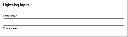
2. <lightning-input>
The lightning-input component is used to create input fields for user input. It supports various input types such as text, email, number, password, and more. Additionally, it provides built-in validation and accessibility features.
Example:
<template>
    <lightning-card title="Lightning Input" >
        <div class="slds-p-around_medium">
            <lightning-input type="text" label="Enter Name" value={name} onchange={handleChange}></lightning-input>
            <p>You entered: {name}</p>
        </div>
    </lightning-card>
</template>
import { LightningElement, track } from 'lwc';
export default class InputExample extends LightningElement {
@track name = '';
handleChange(event) {
this.name = event.target.value;
}
}
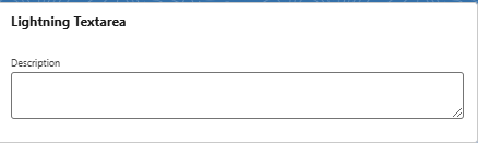
3. <lightning-textarea>
The lightning-textarea component in Lightning Web Components (LWC) is used to create a multiline input field that allows users to enter and edit longer pieces of text. It is commonly used for comments, descriptions, notes, or any other input that requires more than a single line.
Example:
<template>
    <lightning-card title="Lightning Textarea" >
        <div class="slds-p-around_medium">
                <lightning-textarea label="Description" value={description} onchange={handleTextareaChange}></lightning-textarea>
        </div>
    </lightning-card>
</template>
import { LightningElement, track } from 'lwc';
export default class TextareaExample extends LightningElement {
@track description = '';
handleTextareaChange(event) {
this.description = event.target.value;
}
}
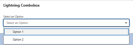
4. <lightning-combobox>
The lightning-combobox component in LWC provides a dropdown list that allows users to select a single option from predefined choices. It supports dynamic options, placeholder text, and event handling for selection changes. This component is commonly used in forms, filters, and data selection interfaces in Salesforce applications.
Example:
<template>
    <lightning-card title="Lightning Combobox" >
        <div class="slds-p-around_medium">
            <lightning-combobox
            label="Select an Option"
            value={selectedValue}
            options={options}
            onchange={handleChange}>
            </lightning-combobox>
        </div>
    </lightning-card>
</template>
import { LightningElement, track } from 'lwc';
export default class ComboboxExample extends LightningElement {
@track selectedValue = '';
@track options = [
{ label: 'Option 1', value: 'option1' },
{ label: 'Option 2', value: 'option2' }
];
handleChange(event) {
this.selectedValue = event.detail.value;
}
}
5. <lightning-card>
The lightning-card component in LWC is used to create a structured and visually distinct card layout with a header, body, and optional footer. It provides a consistent way to display grouped information, such as record details or related data, while maintaining a clean and responsive design. The component supports actions, icons, and slot-based customization, making it a flexible choice for organizing UI content in Salesforce applications.
Example:
<template>
    <lightning-card title="Account Details">
        <p slot="footer">Footer Content</p>
        <div class="slds-m-around_medium">
            This is an example of a lightning card.
        </div>
    </lightning-card>
</template>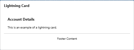
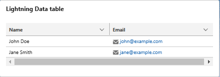
6. <lightning-datatable>
The lightning-datatable component in LWC is used to display tabular data with built-in features like sorting, pagination, filtering, and inline editing. It supports multiple column types, row selection, and customizable actions, making it ideal for presenting structured records from Salesforce objects. The component enhances user experience by allowing real-time updates, keyboard navigation, and dynamic data handling. It is widely used in dashboards, reports, and record management interfaces.
Example:
<template>
    <lightning-card title="Lightning Data table" >
        <div class="slds-p-around_medium">
            <lightning-datatable key-field="id" data={data} columns={columns} hide-checkbox-column></lightning-datatable>
        </div>
    </lightning-card>
</template>
import { LightningElement, track } from 'lwc';
export default class DatatableExample extends LightningElement {
@track columns = [
{ label: 'Name', fieldName: 'name', type: 'text' },
{ label: 'Email', fieldName: 'email', type: 'email' }
];
@track data = [
{ id: '1', name: 'John Doe', email: 'john@example.com' },
{ id: '2', name: 'Jane Smith', email: 'jane@example.com' }
];
}
7.<lightning-accordion>
<lightning-accordion> is a Lightning Web Component (LWC) that creates a collapsible section for displaying grouped content. It allows users to expand or collapse sections for better organization and readability. Each section is defined using <lightning-accordion-section>, where you can set titles and content. It supports multiple expansion modes, including single and multiple sections open at a time.
Example:
<template>
    <lightning-card title="Lightning Accordion" >
        <div class="slds-p-around_medium">
            <lightning-accordion>
                <lightning-accordion-section name="section1" label="Section 1">
                    <p>Content for section 1</p>
                </lightning-accordion-section>
                <lightning-accordion-section name="section2" label="Section 2">
                    <p>Content for section 2</p>
                </lightning-accordion-section>
            </lightning-accordion>
        </div>
    </lightning-card>
</template>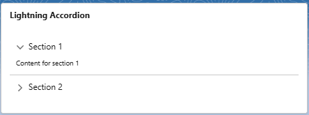
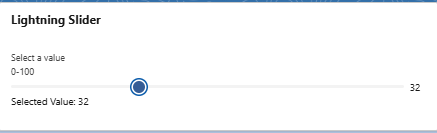
8. <lightning-slider>
The lightning-slider component in Salesforce Lightning Web Components (LWC) enables users to select a value within a defined range by dragging a slider handle. It is highly customizable, allowing developers to set minimum and maximum values, define step increments, and display labels or tooltips for better usability. This component is ideal for scenarios like adjusting settings, selecting numeric values, or filtering data within a specific range, providing an intuitive and interactive user experience.
Example:
<template>
    <lightning-card title="Lightning Slider" >
        <div class="slds-p-around_medium">
            <lightning-slider label="Select a value" min="0" max="100" value={sliderValue} onchange={handleSliderChange}></lightning-slider>
    <p>Selected Value: {sliderValue}</p>
        </div>
    </lightning-card>
</template>
import { LightningElement, track } from 'lwc';
export default class SliderExample extends LightningElement {
@track sliderValue = 50;
handleSliderChange(event) {
this.sliderValue = event.target.value;
}
}
9. <lightning-icon>
The lightning-icon component in Salesforce Lightning Web Components (LWC) is used to display icons with predefined Salesforce styles. It provides a consistent look and feel by using the Salesforce Lightning Design System (SLDS) icons. Developers can specify the icon category, name, size, and color to match the UI requirements. This component enhances user experience by maintaining visual consistency across Salesforce applications.
Example:
<template>
    <lightning-icon icon-name="utility:warning" alternative-text="Warning" size="large" title="Warning Icon"></lightning-icon>
</template>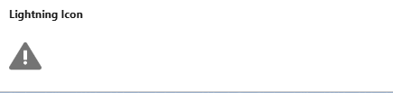
10. <lightning-badge>
The lightning-badge component in Salesforce Lightning Web Components (LWC) is used to display small status indicators or labels. It helps highlight important information, such as statuses, categories, or tags, in a visually distinct way. The component supports customizable labels and styles to fit various UI needs. lightning-badge enhances readability and improves user experience by providing quick contextual insights.
Example:
<template>
    <lightning-card title="Lightning Badge" >
        <div class="slds-p-around_medium">
            <lightning-badge label="New"></lightning-badge>
            <lightning-badge label="Completed" class="slds-theme_success"></lightning-badge>
        </div>
    </lightning-card>
</template>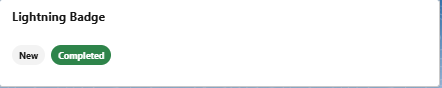
Note: In some examples, I have used the lightning-card component to enhance the visibility of images. However, in real-time scenarios, its use is not necessary.
Best Practices for Using Base Lightning Components
- Use variant attributes: Many components like buttons support variants (brand, destructive, etc.). Choose the right one for the use case.
- Leverage built-in events: Most components provide default event handlers like onchange, onclick, etc., reducing the need for custom event handling.
- Avoid unnecessary wrapping: Use Base Lightning Components directly instead of wrapping them in additional <div> elements unless necessary.
- Ensure proper imports: Always import components correctly to avoid errors (import { LightningElement } from ‘lwc’;).
- Utilize SLDS classes: For additional styling, use SLDS classes instead of custom CSS whenever possible.
Learn more about LWC best practices.
Conclusion
Base Lightning Components in LWC provide a powerful way to build fast, responsive, and user-friendly applications. By leveraging these components, Salesforce developers can create complex UI features with minimal effort while ensuring a seamless user experience. Start integrating Base Lightning Components in your LWC projects today to streamline development and maintain Salesforce’s design consistency!