The lightning-combobox component in Salesforce Lightning Web Components (LWC) is for creating user-friendly dropdown menus. Whether you’re building forms, filters, or dynamic UIs, ComboBoxes streamline data selection while ensuring data integrity. In this guide, we’ll explore how to implement ComboBoxes in LWC with practical examples and best practices.
Why Use a ComboBox?
- Enhanced User Experience: Simplify selections from large datasets.
- Data Consistency: Restrict input to predefined valid options.
- Dynamic Behavior: Enable dependent dropdowns (e.g., selecting a country first, then a city).
The Basics: lightning-combobox Attributes
Key attributes to customize your ComboBox:
- name: Identifier for the component.
- label: Display text above the dropdown.
- placeholder: Hint text when no option is selected.
- value: Currently selected value (supports two-way binding).
- options: Array of objects with label and value properties.
- onChange: Event handler for selection changes.
1. Basic Usage of lightning-combobox
The <lightning-combobox> is very straightforward to use. It is similar to a standard HTML <select> element but with additional styling, features, and built-in accessibility improvements provided by Salesforce.
Example 1: Simple ComboBox with Static Options
<template>
  <lightning-combobox name="fruit"
                    label="Select a Fruit"
                    value={selectedValue}
                    options={fruitOptions}
                    onchange={handleChange} >
  </lightning-combobox>
</template>
import { LightningElement } from 'lwc';
export default class ComboBoxExamples extends LightningElement {
selectedValue = '';
fruitOptions = [
{ label: 'Apple', value: 'apple' },
{ label: 'Orange', value: 'orange' },
{ label: 'Banana', value: 'banana' },
];
handleChange(event) {
this.selectedValue = event.detail.value;
}
}
In this example:
- fruitOptions contains an array of objects, each object has a label (what is shown in the dropdown) and a value (what is stored when selected).
- The onChange handler updates the selected value when the user picks an option.
- The selected value is stored in selectedValue.
2. ComboBox with Dynamic Data
Often, the list of options comes from an external source, such as an Apex method or API. We can dynamically populate the options in the ComboBox.
HTML file:
<template>
    <lightning-card title="ComboBox Example">
        <div class="slds-p-around_medium">
        <lightning-combobox name="country" label="Select a Country" value={selectedValue} options={countryOptions}
            onchange={handleChange}></lightning-combobox>
        </div>
    </lightning-card>

</template>
Javascript:
import { LightningElement, wire, track } from 'lwc';
import getCountriesList from '@salesforce/apex/DataUtility.getCountriesList';
export default class ComboBoxExamples extends LightningElement {
    selectedValue = '';
    @track countryOptions = [];

    handleChange(event) {
        this.selectedValue = event.detail.value;
    }

    @wire(getCountriesList)
    wiredCountires({error, data}){
        if(data){
            this.countryOptions = data.map( country => ({ label: country.Name, value: country.Id}));
        }else if(error){
            console.log('Error occurred while fetching Data '+ error);
        }
    }

}
public class DataUtility {
@AuraEnabled(cacheable=true)
public static List<countries__c> getCountriesList(){
List<countries__c> countriesList = [Select id, name from countries__c];
return countriesList;
}
}
In this example:
- We use the @wire service to call an Apex method (getCountriesList) to get a list of countries.
- The wiredCountries function maps the fetched data into an array of options for the ComboBox.
- When a user selects a country, the selected country ID is stored in selectedCountry.
- The Apex method getCountriesList should return a list of country records with Name and Id properties.
3. Dependent ComboBoxes
Dependent ComboBoxes are a common UI pattern where the options in one dropdown (child) depend on the selection made in another dropdown (parent). For example, selecting a Country in the first dropdown should dynamically populate the City dropdown with relevant options. This creates a more intuitive and user-friendly experience.
Country and City Dependent ComboBoxes:
Let’s build a dependent ComboBox where:
- The Country dropdown contains a list of countries.
- The City dropdown is populated with cities based on the selected country.
HTML code:
Create the structure for the two ComboBoxes. The city dropdown will be disabled until a country is selected.
<template>
    <lightning-card title="ComboBox Example">
        <div class="slds-p-around_medium">
            <lightning-combobox name="country" label="Country" options={countryOptions} onchange={handleCountryChange}>
            </lightning-combobox>

            <lightning-combobox name="city" label="City" options={cityOptions}>
            </lightning-combobox>
        </div>
    </lightning-card>

</template>
JavaScript Logic
- Define the countryOptions array with static or dynamic data.
- Use the handleCountryChange method to update the cityOptions based on the selected country.
import { LightningElement, track} from 'lwc';
export default class ComboBoxExamples extends LightningElement {
    selectedCountry;
    @track cityOptions = [];
    countryOptions = [
        { label: 'USA', value: 'usa' },
        { label: 'Canada', value: 'canada' }
    ];


    handleCountryChange(event) {
        this.selectedCountry = event.detail.value;
        this.cityOptions = this.getCities(this.selectedCountry);
    }


    getCities(country) {
        const cities = {
            usa: [
                { label: 'New York', value: 'ny' },
                { label: 'Los Angeles', value: 'la' }
            ],
            canada: [
                { label: 'Toronto', value: 'to' },
                { label: 'Vancouver', value: 'vc' }
            ]
        };
        return cities[country] || [];
    }


}

Above screenshot is an example of dependent combobox.
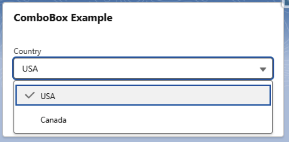
First combobox having two countries USA and Canada. Each country has different state which are available in the city combobox.

When we select the USA, we are only able to select NewYork or Los Angeles.

When we select Canada, we are only able to select Toronto or Vancouver.
Summary
The lightning-combobox is a versatile component for building intuitive interfaces in Salesforce LWC. By mastering static, dynamic, and dependent dropdowns, you can create seamless user experiences while maintaining data accuracy. Experiment with the examples above and explore the Salesforce documentation for advanced features like multi-select and custom styling. Happy coding! 🙂