A lightning-card in Lightning Web Components (LWC) is used to create a stylized container for grouping information. It can be used to display a single item or a group of items, such as a related list. Here are some key features. Join us to Exploring Lightning Card in Lightning Web Component (LWC).
- Title: Displays a title for the card.
- Body: Contains the main content of the card
- Actions: Optional slot for adding buttons or other interactive elements
- Footer: Optional section for additional information or links
- Icon: Can include an icon in the header
In this blog post, we will explore a variety of Lightning Card styles and variants, including basic cards, cards with icons, headers, footers, actions, and more.
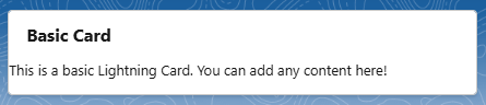
1. Basic Lightning Card
The simplest form of a Lightning Card provides a clean layout for information display.
<lightning-card title="Basic Card">
    <p>This is a basic Lightning Card. You can add any content here!</p>
</lightning-card> - <lightning-card> Tag: It’s a Base component provided by salesforce for creating card -styles containers. It’s commonly used to group related information in a visually district bordered section.
- title: Defines the main heading of the card.
Output:
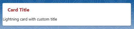
2. Lightning Card with a customized title
In the previous example, we demonstrated how to set the header of a card by passing a value to the title attribute in the <lightning-card> tag. However, this method does not allow for customization of the header, such as specifying colors or making the text bold. To achieve this, you can use the slot attribute and pass the title as a slot, enabling you to include markup for further customization.
HTML code:
<template>
    <lightning-card>
        <h3 slot="title" class="t"
            Card Title
        </h3>
        <p>Lightning card with custom title</p>
    </lightning-card>
</template>
CSS code:
.t{
    color:brown;
}
We can define the custom style in the CSS file, as shown in the above code. Lightning card with Brown colored header as below screenshot.
Output:
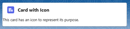
3. Card with Icon
Enhance your card with an icon for better visual representation:
<lightning-card title="Card with Icon" icon-name="standard:account">
    <p>This card has an icon to represent its purpose.</p>
</lightning-card>
lightning-card displays an SLDS icon if you pass an icon name with the icon-name attribute. The icon is rendered using lightning-icon.
When applying SLDS classes or icons, check that they are available in the SLDS release tied to your org. The latest SLDS resources become available only when the new release is available in your org.
- Choose icons that align with the content type for added clarity.
Output:
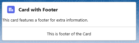
4. Card with Footer
Footers provide additional context or actions related to card content. The card footer is optional and can contain an action to link to another page.
<template>
    <lightning-card title="Card with Footer" icon-name="standard:account">
        <p>This card features a footer for extra information.</p>
        <div slot="footer">
            <p>This is footer of the Card</p>
        </div>
    </lightning-card>
</template>
Output:
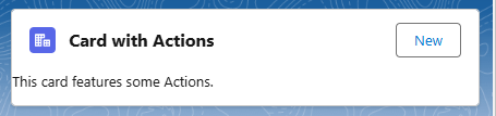
5. Card with Actions
Use the actions slot to pass content such as lightning-button-icon or lightning-button to perform an action when clicked. Actions are displayed on the top corner of the card opposite the title.
<template>
    <lightning-card title="Card with Actions" icon-name="standard:account">
        <p>This card features some Actions.</p>
        <lightning-button label="New" slot="actions"></lightning-button>
    </lightning-card>
</template>- Ensure actions are relevant and intuitive.
Output:
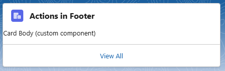
6. Add an Action to the Footer Slot
The card footer is optional and can contain an action to link to another page. If using the card footer, salesforce recommend using a View All link that takes a user to the object list view
This below example adds the View All link to the footer slot, specifying the slds-card__footer-action class on the <a> tag. This class makes the footer’s click target span the entire width of the card so you can click anywhere in the footer. The class isn’t required.
For a View All link, set the href value of the tag to a URL to take the user to the object list view.
<template>
    <lightning-card title="Actions in Footer" icon-name=”standard:account”>
        <p>Card Body (custom component)</p>
        <div slot="footer">
            <a class="slds-card__footer-action"
 href="#">View All <span class="slds-assistive-text">Accounts</span> </a>
        </div>
    </lightning-card>
</template>
Output:
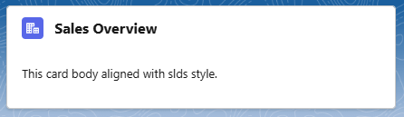
7. Basic Card with SLDS Classes
To apply additional styling, use the SLDS utility classes with the class attribute, as shown in the below example.
<template>
    <lightning-card title="Sales Overview" icon-name="standard:account">
     <div class="slds-p-around_medium">
             This card body aligned with slds style.
     </div>
  </lightning-card>
</template>
The class slds-p-around_medium is part of the Salesforce Lightning Design System (SLDS) utility classes. It is used for applying padding around an element.
Breakdown of the Class:
slds-: This prefix indicates that it’s a class from the Salesforce Lightning Design System.
p: This stands for “padding.”
around: This means that the padding will be applied to all four sides of the element (top, right, bottom, and left).
medium: This specifies the size of the padding. In this case, “medium” corresponds to a predefined medium padding value as defined in SLDS.
When we apply the class slds-p-around_medium to an element, it adds medium-sized padding around that element, which helps to create space between the element and its surrounding content. This is particularly useful for ensuring that text, buttons, or images within a card or container have appropriate spacing for better readability and a more polished layout. This means that the padding will be applied to all four sides of the element (top, right, bottom, and left).
Output:
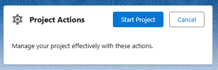
Example 2:
<template>
       <lightning-card title="Project Actions" icon-name="utility:settings">
        <div slot="actions" class="slds-grid slds-grid_align-end">
            <lightning-button label="Start Project" variant="brand"></lightning-button>
            <lightning-button label="Cancel" variant="neutral" class="slds-m-left_small"></lightning-button>
        </div>
        <div class="slds-p-around_medium">
            <p>Manage your project effectively with these actions.</p>
        </div>
    </lightning-card>
</template>
We can also apply custom styling by using the :host selector. Use SLDS styling hooks to customize the component’s style. For example , the below css properly will add the red color border to lightning card
:host {
    --slds-c-card-color-border: red;
}
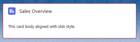
You can refer the different Styling Hooks here https://www.lightningdesignsystem.com/components/cards/#Styling-Hooks-Overview
Conclusion
The lightning-card component is an essential tool for any Salesforce developer looking to enhance their UI. Its flexibility, combined with the power of SLDS, allows for the creation of beautiful, functional cards that can elevate the user experience. By understanding and utilizing its features, you can design intuitive interfaces that help users engage more effectively with your application.
With these additional examples and best practices, you’re now equipped to implement lightning-cards in your Salesforce projects. For more tips and insights on using Salesforce components, stay tuned for future posts! Happy coding!