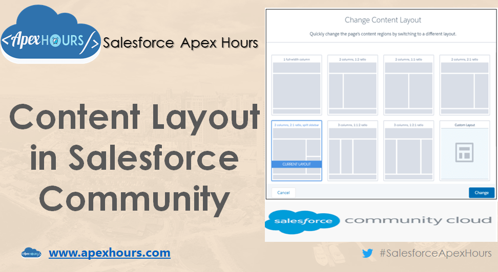
In our last post we learned about how to create Lightning community in Salesforce. In this post we will talk about what is content layout and how to create custom content layout for Salesforce Community. Salesforce Community Builder provided lots of ready to use layout as as two-column layout with 2:1 ratio and etc. However, some time we need custom layout which is not available out of the box. That time we need to create custom content layout.
To create the custom content layout your lightning component must implement the forceCommunity:layout interface and Mark your component global with access=”global” to make the resource usable outside of your own Org.
<aura:component implements="forceCommunity:layout" description="Custom Content Layout" access="global">Here is full sample code
<aura:component implements="forceCommunity:layout" description="Custom Content Layout" access="global">

    <aura:attribute name="section_title_2" type="Aura.Component[]"/>
    <aura:attribute name="section2" type="Aura.Component[]"/>
    <aura:attribute name="section3" type="Aura.Component[]"/>

	<div class="section">
		<div class="section-title">
			{!v.section_title_2}
		</div>
		<div class="row">
			<div class="half">{!v.section2}</div>
			<div class="half">{!v.section3}</div>
		</div>
	</div>

</aura:component>
Attributes declared as Aura.Component[] and included in your markup are rendered in the theme layout component as open regions, which form the basic structure of your theme layout. Users can add drag-and-drop components to these regions in Experience Builder.
Once your code ready then you can change the content layout in your community. Please check below recording for step by step process.
Recording
Further Learning
If you are new in Salesforce. Please check our free Salesforce Admin and Salesforce Developer training. Subscribe to the channel if you haven’t already
Thanks,
Salesforce Apex Hours


