Charts are not just visual enhancements in Salesforce. In real implementations, charts act as decision shortcuts. A sales head does not want to open five reports to understand pipeline health. A support manager should not dig through list views to see where cases are stuck. They want answers immediately, inside the screen they already work on.
Lightning Web Components make this possible. By combining Apex for aggregation and Chart.js for visualization, you can build fast, contextual, and highly customized charts directly inside Salesforce pages.
This article explains how to build different types of charts in LWC, using real Salesforce scenarios.
Why Build Charts in LWC Instead of Reports and Dashboards?
Salesforce reports are great, but they are generic by design. Real projects often involve logic that reports cannot easily handle.
Here’s what usually happens in enterprise orgs:
- Revenue is calculated after CPQ discounts and approvals
- Data visibility depends on role, territory, or hierarchy
- Charts must change based on user interaction
- Analytics must live inside custom apps, not dashboards
LWC charts solve these problems because they sit directly on the UI layer and consume Apex logic that already understands your business rules.
How Charts Work in LWC
Before jumping into code, it’s important to understand the flow.
- Apex aggregates Salesforce data using SOQL
- Chart.js is loaded as a static resource
- LWC renders a canvas element
- Data is passed into Chart.js for visualization
The key idea is simple but important:
Never process large datasets in JavaScript. Always aggregate in Apex.
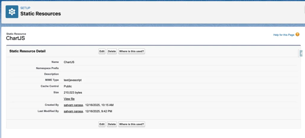
Upload Chart.js as a Static Resource
Salesforce does not allow loading JS libraries directly from a CDN inside LWC. So the only correct approach is to download Chart.js locally and upload it as a Static Resource.
- Go to a https://cdnjs.cloudflare.com/ajax/libs/Chart.js/4.5.0/chart.umd.js
- Copy the whole js code and save into the Local Notepad with the name chart.min.js
- Once you have the file, you need to put it into your Salesforce org.
- Log in to Salesforce and go to Setup.
- In the Quick Find box, type Static Resources and select it.
- Click New.
- Name: Enter ChartJS (Note: Remember this name, you will use it in your code).
- File: Choose the file you just downloaded.
- Cache Control: Set this to Public.
- Click Save.
Common LWC Pattern for All Charts
Every chart component follows the same structure:
- A <canvas> in HTML
- loadScript to load Chart.js
- Apex to fetch aggregated data
- A render method for the chart
Once you understand this pattern, creating new charts becomes straightforward.
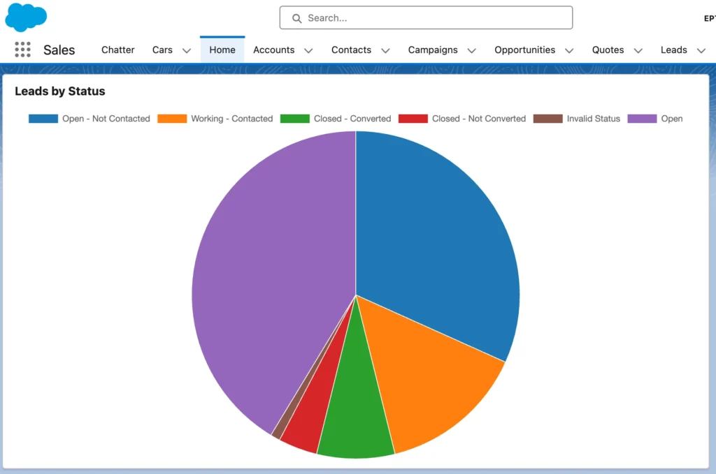
1. Pie Chart in LWC
Sales managers want to know how leads are distributed across statuses like New, Working, and Converted. They are not looking for trends or comparisons. They want distribution.Create a LWC code named leadStatusPieChart and adding the component on the Home page
LWC HTML
<template>
    <lightning-card title="Leads by Status">
        <div class="chart-container">
            <canvas></canvas>
        </div>
    </lightning-card>
</template>
import { LightningElement } from 'lwc';
import { loadScript } from 'lightning/platformResourceLoader';
import chartJs from '@salesforce/resourceUrl/ChartJS';
import getLeadsByStatus from '@salesforce/apex/ChartController.getLeadsByStatus';

export default class LeadStatusPieChart extends LightningElement {

    chart;
    chartInitialized = false;

    renderedCallback() {
        if (this.chartInitialized) {
            return;
        }
        this.chartInitialized = true;

        loadScript(this, chartJs)
            .then(() => {
                this.loadChartData();
            })
            .catch(error => {
                console.error('ChartJS load error', error);
            });
    }

    loadChartData() {
        getLeadsByStatus()
            .then(result => {
                const labels = [];
                const data = [];
                const backgroundColors = [];

                const STATUS_COLOR_MAP = {
                    'Open - Not Contacted': '#1f77b4',
                    'Working - Contacted': '#ff7f0e',
                    'Closed - Converted': '#2ca02c',
                    'Closed - Not Converted': '#d62728',
                    'Open': '#9467bd',
                    'Invalid Status': '#8c564b'
                };

                result.forEach(row => {
                    labels.push(row.Status);
                    data.push(row.total);

                    backgroundColors.push(
                        STATUS_COLOR_MAP[row.Status] || '#7f7f7f'
                    );
                });

                this.renderChart(labels, data, backgroundColors);
            })
            .catch(error => {
                console.error('Apex error', error);
            });
    }

    renderChart(labels, data, backgroundColors) {
        const ctx = this.template.querySelector('canvas').getContext('2d');

        if (this.chart) {
            this.chart.destroy();
        }

        this.chart = new Chart(ctx, {
            type: 'pie',
            data: {
                labels: labels,
                datasets: [{
                    data: data,
                    backgroundColor: backgroundColors,
                    borderColor: '#ffffff',
                    borderWidth: 1
                }]
            },
            options: {
                responsive: true,
                plugins: {
                    legend: {
                        position: 'top'
                    },
                    tooltip: {
                        enabled: true
                    }
                }
            }
        });
    }
}
public class ChartController {
	 @AuraEnabled(cacheable=true)
    public static List<AggregateResult> getLeadsByStatus() {
        return [
            SELECT Status, COUNT(Id) total
            FROM Lead
            GROUP BY Status
        ];
    }
}
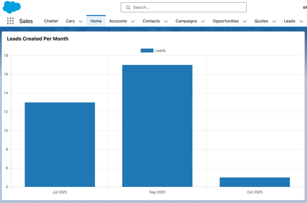
Bar Chart in Salesforce LWC
Pie charts are great for distribution. Bar charts are better when you want to compare values over time.
Here’s a very common business question:
How many leads are we getting every month?
Sales managers look at this to understand growth trends, marketing impact, and seasonality. A bar chart is the most natural way to answer this.
What this chart will show
- X-axis: Month (Jan, Feb, Mar…)
- Y-axis: Number of Leads
- Data source: Salesforce Leads
- Chart type: Bar chart using Chart.js in LWC
Apex Controller
We’ll aggregate leads by month using CALENDAR_MONTH() and CALENDAR_YEAR().
Why Apex is needed here
LWC can’t run SOQL directly. Also, grouping and aggregation is best handled server-side for performance.
public with sharing class LeadMonthlyChartController {

    @AuraEnabled(cacheable=true)
    public static List<MonthlyLeadWrapper> getLeadsPerMonth() {

        List<MonthlyLeadWrapper> result = new List<MonthlyLeadWrapper>();

        List<AggregateResult> arList = [
            SELECT
                CALENDAR_MONTH(CreatedDate) month,
                CALENDAR_YEAR(CreatedDate) year,
                COUNT(Id) total
            FROM Lead
            WHERE CreatedDate = LAST_N_MONTHS:6
            GROUP BY CALENDAR_YEAR(CreatedDate), CALENDAR_MONTH(CreatedDate)
            ORDER BY CALENDAR_YEAR(CreatedDate), CALENDAR_MONTH(CreatedDate)
        ];

        for (AggregateResult ar : arList) {
            result.add(new MonthlyLeadWrapper(
                (Integer) ar.get('month'),
                (Integer) ar.get('year'),
                (Integer) ar.get('total')
            ));
        }

        return result;
    }

    public class MonthlyLeadWrapper {
        @AuraEnabled public Integer month;
        @AuraEnabled public Integer year;
        @AuraEnabled public Integer total;

        public MonthlyLeadWrapper(Integer month, Integer year, Integer total) {
            this.month = month;
            this.year = year;
            this.total = total;
        }
    }
}
LWC HTML
<template>
    <lightning-card title="Leads Created Per Month">
        <div class="chart-container">
            <canvas></canvas>
        </div>
    </lightning-card>
</template>
LWC JavaScript (Bar Chart Logic)
This is where most people go wrong, so read it slowly.
import { LightningElement } from 'lwc';
import { loadScript } from 'lightning/platformResourceLoader';
import chartJs from '@salesforce/resourceUrl/ChartJS';
import getLeadsPerMonth from '@salesforce/apex/LeadMonthlyChartController.getLeadsPerMonth';

export default class LeadsPerMonthBarChart extends LightningElement {

    chartInitialized = false;
    chart;

    renderedCallback() {
        if (this.chartInitialized) {
            return;
        }
        this.chartInitialized = true;

        loadScript(this, chartJs)
            .then(() => {
                this.loadChartData();
            })
            .catch(error => {
                console.error('ChartJS load failed', error);
            });
    }

    loadChartData() {
        getLeadsPerMonth()
            .then(result => {
                const labels = [];
                const data = [];

                result.forEach(row => {
                    labels.push(this.getMonthName(row.month) + ' ' + row.year);
                    data.push(row.total);
                });

                this.renderChart(labels, data);
            })
            .catch(error => {
                console.error('Apex error', error);
            });
    }

    renderChart(labels, data) {
        const ctx = this.template.querySelector('canvas').getContext('2d');

        if (this.chart) {
            this.chart.destroy();
        }

        this.chart = new Chart(ctx, {
            type: 'bar',
            data: {
                labels: labels,
                datasets: [{
                    label: 'Leads',
                    data: data,
                    backgroundColor: '#1f77b4',
                    borderRadius: 6
                }]
            },
            options: {
                responsive: true,
                scales: {
                    y: {
                        beginAtZero: true,
                        ticks: {
                            precision: 0
                        }
                    }
                },
                plugins: {
                    legend: {
                        display: false
                    }
                }
            }
        });
    }

    getMonthName(monthNumber) {
        const months = [
            'Jan', 'Feb', 'Mar', 'Apr', 'May', 'Jun',
            'Jul', 'Aug', 'Sep', 'Oct', 'Nov', 'Dec'
        ];
        return months[monthNumber - 1];
    }
}
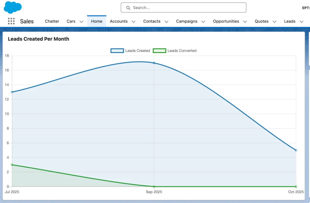
Line Chart in Salesforce LWC
Example: Lead Trend Over Time (Created vs Converted)
Here’s the thing.
Bar charts compare. Pie charts distributed.
Line charts tell a story over time.
Sales heads don’t just want to know how many leads came in. They want to know:
- Are leads increasing or dropping?
- Are conversions keeping up with lead creation?
- Is marketing quality improving month over month?
A line chart answers all of this in one view.
What this chart will show
- X-axis: Month
- Y-axis: Number of Leads
- Line 1: Leads Created
- Line 2: Leads Converted
This gives a clean visual trend instead of raw numbers.
Apex Controller
We’ll aggregate created leads and converted leads month-wise.
We return both values in one query result so LWC doesn’t have to stitch data manually. This keeps logic simple and predictable.
public with sharing class LeadTrendChartController {

    @AuraEnabled(cacheable=true)
    public static List<LeadTrendWrapper> getLeadTrends() {

        List<LeadTrendWrapper> result = new List<LeadTrendWrapper>();

        List<AggregateResult> arList = [
            SELECT
                CALENDAR_MONTH(CreatedDate) month,
                CALENDAR_YEAR(CreatedDate) year,
                COUNT(Id) totalLeads,
                SUM(
                    CASE
                        WHEN IsConverted = true THEN 1
                        ELSE 0
                    END
                ) convertedLeads
            FROM Lead
            WHERE CreatedDate = LAST_N_MONTHS:6
            GROUP BY CALENDAR_YEAR(CreatedDate), CALENDAR_MONTH(CreatedDate)
            ORDER BY CALENDAR_YEAR(CreatedDate), CALENDAR_MONTH(CreatedDate)
        ];

        for (AggregateResult ar : arList) {
            result.add(new LeadTrendWrapper(
                (Integer) ar.get('month'),
                (Integer) ar.get('year'),
                (Integer) ar.get('totalLeads'),
                (Integer) ar.get('convertedLeads')
            ));
        }

        return result;
    }

    public class LeadTrendWrapper {
        @AuraEnabled public Integer month;
        @AuraEnabled public Integer year;
        @AuraEnabled public Integer totalLeads;
        @AuraEnabled public Integer convertedLeads;

        public LeadTrendWrapper(Integer month, Integer year, Integer totalLeads, Integer convertedLeads) {
            this.month = month;
            this.year = year;
            this.totalLeads = totalLeads;
            this.convertedLeads = convertedLeads;
        }
    }
}
LWC HTML
<template>
    <lightning-card title="Lead Trend (Created vs Converted)">
        <div class="chart-container">
            <canvas></canvas>
        </div>
    </lightning-card>
</template>
LWC JavaScript (Line Chart)
This example uses two datasets, which is where line charts shine.
import { LightningElement } from 'lwc';
import { loadScript } from 'lightning/platformResourceLoader';
import chartJs from '@salesforce/resourceUrl/ChartJS';
import getLeadTrends from '@salesforce/apex/LeadTrendChartController.getLeadTrends';

export default class LeadTrendLineChart extends LightningElement {

    chartInitialized = false;
    chart;

    renderedCallback() {
        if (this.chartInitialized) {
            return;
        }
        this.chartInitialized = true;

        loadScript(this, chartJs)
            .then(() => {
                this.loadData();
            })
            .catch(error => {
                console.error('ChartJS load error', error);
            });
    }

    loadData() {
        getLeadTrends()
            .then(result => {
                const labels = [];
                const createdData = [];
                const convertedData = [];

                result.forEach(row => {
                    labels.push(this.getMonthName(row.month) + ' ' + row.year);
                    createdData.push(row.totalLeads);
                    convertedData.push(row.convertedLeads);
                });

                this.renderChart(labels, createdData, convertedData);
            })
            .catch(error => {
                console.error('Apex error', error);
            });
    }

    renderChart(labels, createdData, convertedData) {
        const ctx = this.template.querySelector('canvas').getContext('2d');

        if (this.chart) {
            this.chart.destroy();
        }

        this.chart = new Chart(ctx, {
            type: 'line',
            data: {
                labels: labels,
                datasets: [
                    {
                        label: 'Leads Created',
                        data: createdData,
                        borderColor: '#1f77b4',
                        backgroundColor: 'rgba(31,119,180,0.1)',
                        tension: 0.3,
                        fill: true
                    },
                    {
                        label: 'Leads Converted',
                        data: convertedData,
                        borderColor: '#2ca02c',
                        backgroundColor: 'rgba(44,160,44,0.1)',
                        tension: 0.3,
                        fill: true
                    }
                ]
            },
            options: {
                responsive: true,
                interaction: {
                    mode: 'index',
                    intersect: false
                },
                scales: {
                    y: {
                        beginAtZero: true,
                        ticks: {
                            precision: 0
                        }
                    }
                }
            }
        });
    }

    getMonthName(month) {
        const months = [
            'Jan', 'Feb', 'Mar', 'Apr', 'May', 'Jun',
            'Jul', 'Aug', 'Sep', 'Oct', 'Nov', 'Dec'
        ];
        return months[month - 1];
    }
}
Conclusion
Charts in Salesforce are not just about visuals. They’re about turning raw CRM data into something people can understand in seconds. When you combine LWC with Chart.js, you get full control over how data is fetched, processed, and presented, without being limited by standard report charts.
What really makes these charts work is the structure behind them. Apex handles aggregation and business rules. LWC focuses on presentation and interaction. Chart.js acts as the rendering layer that ties everything together. When each layer has a clear responsibility, the result is clean code and predictable behavior.
Once you understand this pattern, you can build any chart you need in Salesforce. Pie charts for distribution, bar charts for comparison, line charts for trends, and donut charts for KPIs all follow the same foundation. Only the data shape and chart configuration change.
Thanks for Reading. Happing Coding.