
In this post, we will talk about how to create a modal/Popup in Lightning web Component (LWC). There are two ways to create show modals and popups are through styling and making a custom HTML modal or you can use the Winter ’23 Modal Component feature overlays Library called lightning-modal tag.
What is Modal / Popup in Lightning Web Component
Modals/Popup Box are used to display content in a layer above the app. Mostly used to creation or editing of a record, as well as various types of messaging and wizards. Modal/Popup Lightning Web Component(LWC) Salesforce looks like following image.
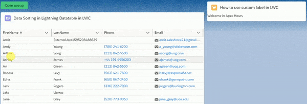
1. Modal / Popup Example Lightning Web component(LWC)
You can take a help from SLDS for creating the modals. Code has following three main part
- section
- header
- footer
Create Lightning web component in your sandbox or developer org.
modalDemoInLWC.html
<template>
    <lightning-button variant="success" label="Open popup"
                        title="Open popup" onclick={showModalBox}>
    </lightning-button>

   <!-- modal start -->
   <template if:true={isShowModal}>

            <!--
                I Used SLDS for this code
                Here is link https://www.lightningdesignsystem.com/components/modals/
            -->

    <section role="dialog" tabindex="-1" aria-labelledby="modal-heading-01" aria-modal="true" aria-describedby="modal-content-id-1" class="slds-modal slds-fade-in-open">
       <div class="slds-modal__container">
        <!-- modal header start -->
          <header class="slds-modal__header">
             <button class="slds-button slds-button_icon slds-modal__close slds-button_icon-inverse" title="Close" onclick={hideModalBox}>
                <lightning-icon icon-name="utility:close"
                   alternative-text="close"
                   variant="inverse"
                   size="small" ></lightning-icon>
                <span class="slds-assistive-text">Close</span>
             </button>
             <h2 id="modal-heading-01" class="slds-text-heading_medium slds-hyphenate">Welcome in Apex Hours</h2>
          </header>

          <!-- modal body start -->
          <div class="slds-modal__content slds-p-around_medium" id="modal-content-id-1">
                <p>Modal/Popup in Lightning Web Component (LWC) Demo</p>
          </div>

          <!-- modal footer start-->
          <footer class="slds-modal__footer">
             <button class="slds-button slds-button_neutral" onclick={hideModalBox}>Cancel</button>
          </footer>

       </div>
    </section>
    <div class="slds-backdrop slds-backdrop_open"></div>
 </template>
 <!-- modal end -->

</template>- Enable and disable the modal with template if:true
- Use section role=’dialog’
modalDemoInLWC.js
import { LightningElement,track } from 'lwc';

export default class ModalDemoInLWC extends LightningElement {
    @track isShowModal = false;

    showModalBox() {
        this.isShowModal = true;
    }

    hideModalBox() {
        this.isShowModal = false;
    }
}
modalDemoInLWC.js-meta.js
<?xml version="1.0" encoding="UTF-8"?>
<LightningComponentBundle xmlns="http://soap.sforce.com/2006/04/metadata">
    <apiVersion>48.0</apiVersion>
    <isExposed>true</isExposed>
      <targets>
        <target>lightning__AppPage</target>
        <target>lightning__RecordPage</target>
        <target>lightning__HomePage</target>
    </targets>
</LightningComponentBundle>
2. Create Overlays with the New Winter ’23 Modal Component
Salesforce introduce a new overlay tag in winter 23 for LWC called lightning-modal. To create a modal component in LWC, You need to import LightningModal from lightning/modal in your JavaScript file. Then, create a component class that extends LightningModal
import { api } from 'lwc';
import LightningModal from 'lightning/modal';

export default class MyModal extends LightningModal {

    handleOkay() {
        this.close('okay');
    }
}
This component doesn’t use a lightning-modal tag. Instead, the modal’s HTML template uses helper lightning-modal-* components to make the modal’s header, footer, and body. The lightning-modal-body component is required, and the others are optional
<!-- c/myModal.html -->

<template>
    <lightning-modal-header label="My Modal Heading"></lightning-modal-header>
    <lightning-modal-body>This is the modal’s contents.</lightning-modal-body>
    <lightning-modal-footer>
        <lightning-button label="OK" onclick={handleOkay}></lightning-button>
    </lightning-modal-footer>
</template>
Summary
Learn more about model in lightning web component from here. Default modals are used in the vast majority of cases. They are as wide as 50% of the viewport, but include a minimum and maximum width to avoid going too narrow or too wide.


I need a pop up with selection where it will be anything other that radio type to achieve single selection with bg color changing on selection ..any idea ?
What if we need Navigation and Modal both together,how will we extend both of them.
Can you please help in providing the jest unit test for the same, thanks!
We will write one post on same soon
B2B and B2C buttons, two buttons are there lwc components , those are popup window needs to be opened in a new screen or window. please let me know the solution
Use this directive “isShowModal” to something like below:
@track isShowModal = {
isB2B: false,
isB2C: false
}; //Handle this property to set the flags
HTML-
B2B Modal Content
B2C Modal Content
I used Modal / Popup Example Lightning Web component(LWC) code on click of custom action which is on record page and modified the code accordingly for showmodal. but cross icon getting displaced on screen .
also I added ok button which is calling apex class but after clicking ok or close popup getting closed but cross not going n need to explicitely close that ,Added my code below .
Submit For Approval
Cancel
OK
import { LightningElement,api,track,wire } from ‘lwc’;
import submitForApproval from ‘@salesforce/apex/MNT_SubmitForApproval.sendForApproval’;
import successMsg from ‘@salesforce/label/c.MNT_submit_For_Approval’;
import { ShowToastEvent } from ‘lightning/platformShowToastEvent’;
import { NavigationMixin } from ‘lightning/navigation’;
export default class MNT_submitForApproval extends LightningElement {
@api recordId;
@track isModalOpen = true ;
mediaPlanId;
label = {
successMsg
};
//Boolean tracked variable to indicate if modal is open or not default value is false as modal is closed when page is loaded
closeModal() {
// to close modal set isModalOpen tarck value as false
this.isModalOpen = false;
}
submitDetails() {
// to close modal set isModalOpen tarck value as false
//Add your code to call apex method or do some processing
this.isModalOpen = false;
console.log(‘inside ok’);
submitForApproval({
recordId:this.recordId,
})
.then(result => {
this.mediaPlanId = result;
console.log(‘result’,result);
this.dispatchEvent(
new ShowToastEvent({
title: ‘Success’,
message: this.label.successMsg,
variant: ‘success’ })
);
this.navigateToRecordPage();
})
.catch(error => {
this.errorMsg = (error.body && error.body.message) ? error.body.message : error.message;
console.log(‘error’,error);
this.dispatchEvent(
new ShowToastEvent({
title: ‘Error Sending for Approval’,
message: this.errorMsg,
variant: ‘error’
})
);
});
}
navigateToRecordPage() {
console.log(‘this.budgetId’,this.recordId);
window.location.href = ‘/lightning/r/’+this.recordId+’/view’;
}
}
The closing of modal does not work.
What is the easiest workaround, can you show a demo of this working?