In today’s fast-paced business environment, it’s essential for an organization’s internal applications to be intuitive and well-organized. In this post, we will explore how we can leverage Salesforce’s Lightning Web Components (LWC) and the native <lightning-vertical-navigation> framework to create a simple, yet powerful, Employee Portal. We will walk through a generic use case, review the code, highlight key implementation details and examine the advantages of building navigation with LWC.
Business Use Case: An Employee Self-Service Portal
Let’s imagine we’re part of a mid-sized company looking to centralize HR and IT resources in a single Employee Portal. We want our colleagues to quickly access:
- HR Section:
- Employee Profile: where they can view and update personal details.
- Payroll: where they can check payslips and download tax documents.
- IT Section:
- Support Tickets: where they can submit or track IT requests.
- System Status: where they can see the current health of mission-critical applications.
Our goal is to use Salesforce as the platform and build a Lightning page component with no external frameworks, minimal or no custom CSS so that users enjoy consistent styling, keyboard accessibility and mobile responsiveness out of the box as per any business requirements.
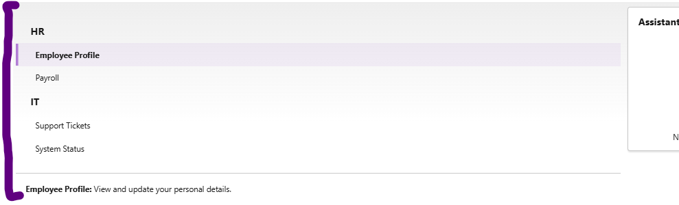
Post following steps from this blog and implementation our screen will look like as below:
Actual Use Of The Approach
- Use Native Vertical Navigation: Standard Salesforce functionality or components provides <lightning-vertical-navigation>, <lightning-vertical-navigation-section> and <lightning-vertical-navigation-item> that will help up for very less customizations. These are built on SLDS (Salesforce Lightning Design System), that will be giving us accessibility, focus management and visual consistency without doing anything new implementation or customization.
- Define Sections and Items: We will group related navigation items under sections HR differentiating with IT and supply a name attribute to each item, which our JavaScript controller can use to determine which content to display.
- Implement Content Switching: In our JavaScript, we will track the selected item in a reactive property (@track selectedItem) and expose boolean getters (isProfile, isPayroll, etc.) to toggle which content template is rendered we may implement different scenarios as per any requirements.
- Expose on Lightning Pages: Finally, we will configure the component bundle’s XML to make it available on App, Record and Home pages as per our needs, so our Employee Portal can live wherever it’s most convenient.
Code Walkthrough
Below is the exact code we used in our org. That can be copy, paste and deploy as-is. Note that we have set the API version to 64.0, but can adjust this to match the org’s version.
verticalNav.html:
<template>
<!-- Employee Portal Nav with two sections: HR and IT -->
<lightning-vertical-navigation
selected-item={selectedItem}
onselect={handleSelect}
class="slds-m-around_medium">
<!-- HR Section -->
<lightning-vertical-navigation-section label="HR" name="hrSection">
<lightning-vertical-navigation-item label="Employee Profile" name="profile"></lightning-vertical-navigation-item>
<lightning-vertical-navigation-item label="Payroll" name="payroll"></lightning-vertical-navigation-item>
</lightning-vertical-navigation-section>
<!-- IT Section -->
<lightning-vertical-navigation-section label="IT" name="itSection">
<lightning-vertical-navigation-item label="Support Tickets" name="tickets"></lightning-vertical-navigation-item>
<lightning-vertical-navigation-item label="System Status" name="status"></lightning-vertical-navigation-item>
</lightning-vertical-navigation-section>
</lightning-vertical-navigation>
<div class="slds-p-around_medium slds-border_top">
<template if:true={isProfile}>
<p><b>Employee Profile:</b> View and update your personal details.</p>
</template>
<template if:true={isPayroll}>
<p><b>Payroll:</b> Check your latest payslips and tax documents.</p>
</template>
<template if:true={isTickets}>
<p><b>Support Tickets:</b> Submit or track IT support requests.</p>
</template>
<template if:true={isStatus}>
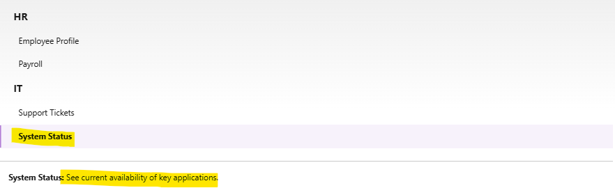
<p><b>System Status:</b> See current availability of key applications.</p>
</template>
</div>
</template>verticalNav.js
import { LightningElement, track } from 'lwc';

export default class VerticalNavigation extends LightningElement {
    @track selectedItem = 'profile';  // default view

    handleSelect(event) {
        // event.detail.name it will give the name of the clicked item
        this.selectedItem = event.detail.name;
    }

    // getters to drive conditional templates
    get isProfile() {
        return this.selectedItem === 'profile';
    }
    get isPayroll() {
        return this.selectedItem === 'payroll';
    }
    get isTickets() {
        return this.selectedItem === 'tickets';
    }
    get isStatus() {
        return this.selectedItem === 'status';
    }
}
verticalNav.js-meta.xml
<?xml version="1.0" encoding="UTF-8"?>
<LightningComponentBundle xmlns="http://soap.sforce.com/2006/04/metadata">
    <apiVersion>64.0</apiVersion>
    <isExposed>true</isExposed>
    <targets>
        <target>lightning__AppPage</target>
        <target>lightning__RecordPage</target>
        <target>lightning__HomePage</target>
    </targets>
</LightningComponentBundle>
Best Practices of Vertical Navigation in LWC
1. Why Vertical Navigation?
Vertical navigation helps us surface multiple categories in a compact, logical structure. In an Employee Portal scenario:
- We keep HR and IT resources separate, so users immediately know where to look.
- We avoid page clutter by loading a single content panel rather than multiple unrelated sections.
- We preserve whitespace and mobile responsiveness.
2. Sections vs. Items
- <lightning-vertical-navigation-section> this will group the related items under a shared header that will improve scannability.
- <lightning-vertical-navigation-item> this will represent a single navigation link. The name attribute should be unique and short; it drives our JS logic.
3. Reactivity and Template Rendering
Using @track selectedItem ensures that when a user selects a new item, the component re-renders the correct <template if:true> block. The boolean getters (isProfile, etc.) make our markup clean:
<template if:true={isProfile}>
    <!-- only shown when selectedItem is 'profile' -->
</template>
4. Event Handling
The onselect event on <lightning-vertical-navigation> bubbles up a name in event.detail.name. This is simpler than manually wiring click listeners on each item. It also respects keyboard navigation (arrow keys, focus states) automatically.
5. Exposing the Component
In our XML configuration, we expose the component to App, Record, and Home pages. If desired, we can extend it to Utility Bar or Experience Builder by adding additional <target> entries.
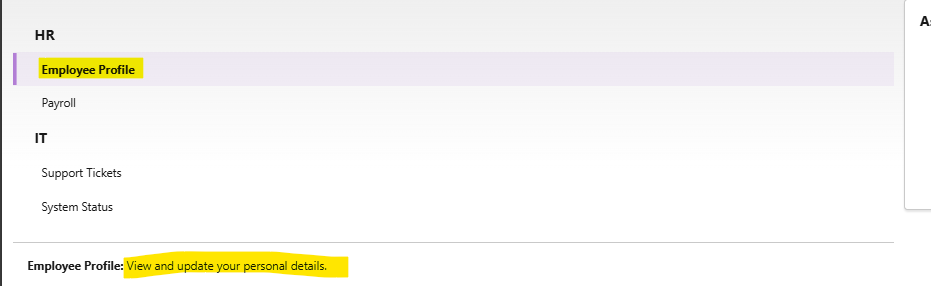
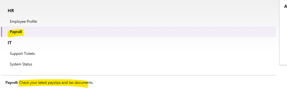
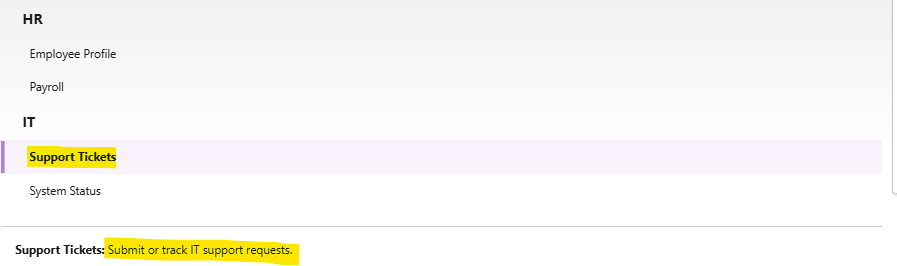
Below are the few screenshots once we clicked on different sections on UI:
Employee Profile:
Payroll:
Support Tickets:
System Status:
Advantages of Using <lightning-vertical-navigation> in LWC
- Native SLDS Styling: We don’t write custom CSS for active states, hover effects or focus rings. Salesforce maintains SLDS, so our nav always looks on-brand.
- Accessibility Out of the Box: Keyboard navigation and screen-reader announcements come built into these base components.
- Maintainability: By relying on standard markup, future edits (new items, renaming) require minimal code changes or no CSS classes to figure out.
- Performance: Base components are optimized for performance and minimal reflows. Our small JS controller only handles state, not DOM manipulation.
- Consistency Across Products: If we later use the same style in other internal tools, the look and feel remain consistent, reducing training overhead.
Conclusion
By combining this Salesforce’s native <lightning-vertical-navigation> components with a simple LWC controller implementation, we can quickly build the easiest and clear, accessible Employee Portal navigation. This approach minimizes any type of maintenance for future, ensures consistent branding and delivers a great user experience on any device. Feel free to extend the use case, add more sections, integrate data from Apex or wire up navigation to record pages and enjoy the power of LWC and SLDS!
Happy coding and may this pattern serve as a building block for many more internal applications 🙂