Creating a skilled, brand-consistent user experience in Salesforce mostly comes down to a small set of visual choices like colors, spacing, shadows and how the UI will adapt when users may want to prefer dark mode. Building a lightweight, maintainable theming system for Lightning Web Components (LWC) helps keep those choices consistent across apps and makes runtime theme switching smooth. This blog will walk us through the core ideas building a design token system, adding dark mode and enabling dynamic theme switching and finishes with the simplest, production-ready example that can be dropped into an org.
Why a custom theming system matters
Design tokens turn visual decisions (like brand-primary, surface-elevation-1, radius-md) into named values that are easy to reuse and update. When tokens are applied consistently across LWCs, refactoring the look and feel becomes safe and fast. Adding a dark mode variant of the same tokens lets the UI adapt without rewriting component styles. Finally, allowing dynamic theme switching (persisted per user or per device) supports accessibility preferences and product based branding experiments.
Salesforce’s modern guidance emphasizes CSS custom properties (styling hooks or global styling hooks) as the future friendly approach for theming LWCs; these make runtime updates simple and let custom components reflect org level Themes and Branding when needed.
The design token system
A practical token system starts with a small set of categories:
- Colors : –brand-primary, –surface, –text-primary, –muted
- Spacing : –space-xs, –space-sm, –space-md
- Typography : –font-size-base, –line-height
- Elevation / surfaces : –card-bg, –card-shadow
- Border / radius : –radius-sm, –radius-md
Store tokens as a JSON file (or a static resource) and map them to CSS custom properties at runtime. Keeping tokens in JSON makes it easy for admins/designers to export from design tools (Figma) and for developers to programmatically apply updates.
Example token JSON:
{
  "light": {
    "--bg": "#ffffff",
    "--text-primary": "#10233b",
    "--brand-primary": "#0b6dd8",
    "--card-bg": "#f4f6f9"
  },
  "dark": {
    "--bg": "#0b1220",
    "--text-primary": "#e6eef8",
    "--brand-primary": "#58a6ff",
    "--card-bg": "#0f1724"
  }
}
This approach keeps tokens single-sourced and easy to switch between themes.
Dark mode and styling hooks: what to pick
Two complementary approaches exist:
- CSS custom properties + document-level application. Define token values as CSS variables on :root (document.documentElement) and use var (–… ) inside component CSS. Because CSS custom properties cross shadow DOM boundaries when defined on root, LWCs can consume them without special other codes.
- Salesforce styling hooks / SLDS 2. For components that should respond to the org-level Theme & Branding settings, prefer styling hooks and the SLDS 2 model. SLDS 2 shifts the system toward global styling hooks (CSS custom properties) and provides a forward path for dark mode in the platform. Where integration with the org’s brand is required, styling hooks are the recommended path.
Note: platform-level dark-mode support is rolling out in stages; plan for graceful fallback and a local theme toggle until org-level dark mode is enabled for all environments.
Example for LWC theme switcher with applied above details
The following example is very minimal for understanding: a single LWC that exposes a toggle and demonstrates theme switching for a small card. This is perfect for understanding and easy to gather all our knowledge.
Files to create
- themeDemo.html
- themeDemo.js
- themeDemo.css
- tokens.json (optional static resource)
themeDemo.html
<template>
  <div class="controls">
    <lightning-button label={buttonLabel} title={buttonLabel} onclick={toggleTheme}></lightning-button>
  </div>

  <section class="demoCard">
    <h2 class="title">Product Summary</h2>
    <p class="body">This is a simple demonstration of a theme-aware card using design tokens.</p>
    <a href="javascript:void(0)" class="cta">Primary action</a>
  </section>
</template>
themeDemo.js
import { LightningElement, track } from 'lwc';
const THEMES = {
  light: {
    '--bg': '#ffffff',
    '--text-primary': '#10233b',
    '--brand-primary': '#0b6dd8',
    '--card-bg': '#f4f6f9'
  },
  dark: {
   '--bg': '#0b1220',
    '--text-primary': '#e6eef8',
    '--brand-primary': '#58a6ff',
    '--card-bg': '#0f1724'
  }
};

export default class ThemeDemo extends LightningElement {
  @track current = 'light';

  connectedCallback() {
    const saved = window.localStorage.getItem('lwc_theme') || 'light';
    this.applyTheme(saved);
  }

  get buttonLabel() {
    return this.current === 'dark' ? 'Switch to Light' : 'Switch to Dark';
  }

  toggleTheme() {
    const next = this.current === 'dark' ? 'light' : 'dark';
    this.applyTheme(next);
  }

  applyTheme(name) {
    const theme = THEMES[name] || THEMES.light;
    Object.keys(theme).forEach(key => {
      document.documentElement.style.setProperty(key, theme[key]);
    });
    this.current = name;
    window.localStorage.setItem('lwc_theme', name);
    // dispatch an event if other components should react
    this.dispatchEvent(new CustomEvent('themechanged', { detail: { theme: name }, composed: true, bubbles: true }));
  }
}
themeDemo.css
:host {display:block; padding: 1rem; background: var(--bg); color: var(--text-primary); min-height: 150px;}
.controls {margin-bottom: 0.75rem;}
.demoCard {
  background: var(--card-bg);
  border-radius: 8px;
  padding: 1rem;
  box-shadow: 0 2px 6px rgba(0,0,0,0.06);
}
.title { margin:0 0 0.5rem 0; }
.cta {
  display:inline-block;
  margin-top:0.75rem;
  padding:0.5rem 0.75rem;
  border-radius:6px;
  text-decoration:none;
  background: var(--brand-primary);
  color: white;
}
Notes about this implementation
- CSS variables are applied to document.documentElement, making them visible inside the shadow DOM of LWCs.
- LocalStorage persists the chosen theme between sessions.
- The component also fires a themechanged event so other components (if added to the same Lightning page) can respond.
This minimal pattern is safe to extend: replace the inline THEMES with values loaded from a static resource (tokens.json) or from a server-side config for admin-driven values.
Deployment steps and screenshots of above implementation
- Create the LWC named themeDemo with the three files above and deploy to the org.
- Add the component to a Lightning App Builder page (or an Experience Builder page for sites).
- Open the app page in Lightning Experience
Below screenshot shows the default (light) theme showing the card.
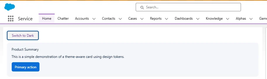
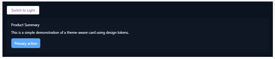
- Click the toggle to switch to dark
Post clicking on the ‘Switch to Dark’ page our org component will look like as below.
- Optionally show the browser’s DevTools Styles panel highlighting :root variables.
Above visuals will clear token values, before/after and how the tokens live on :root. That is very helpful for an implementation or our understanding.
Real-time scenarios and practical tips
- Branded partner portals / Experience Cloud: Let admins upload brand color tokens via a small admin UI; consumer-facing sites can switch themes per brand or per user.
- Feature flags / experiments: A/B test a new accent color or surface elevation by swapping only a token set rather than changing component templates.
- Accessibility / preference matching: Honor prefers-color-scheme CSS media query at first render and provide a persistent user toggle that overrides the system preference.
- Integration with org Themes & Branding: For components that must reflect org-level branding, use Salesforce styling hooks / SLDS 2 so custom components adapt automatically.
Conclusion
A lightweight theming system built on design tokens and CSS custom properties gives a reliable path to consistent, switchable themes in LWC apps. Start small: a compact token set, a single theme-toggle component and a plan to centralize tokens (static resource or admin UI). Where org level branding is required, prefer styling hooks and SLDS 2 to stay aligned with platform evolution. This setup keeps the UI flexible, accessible and straightforward to document and ideal for both internal apps and customer facing sites.